A geometric identity built on structure, balance, and precision
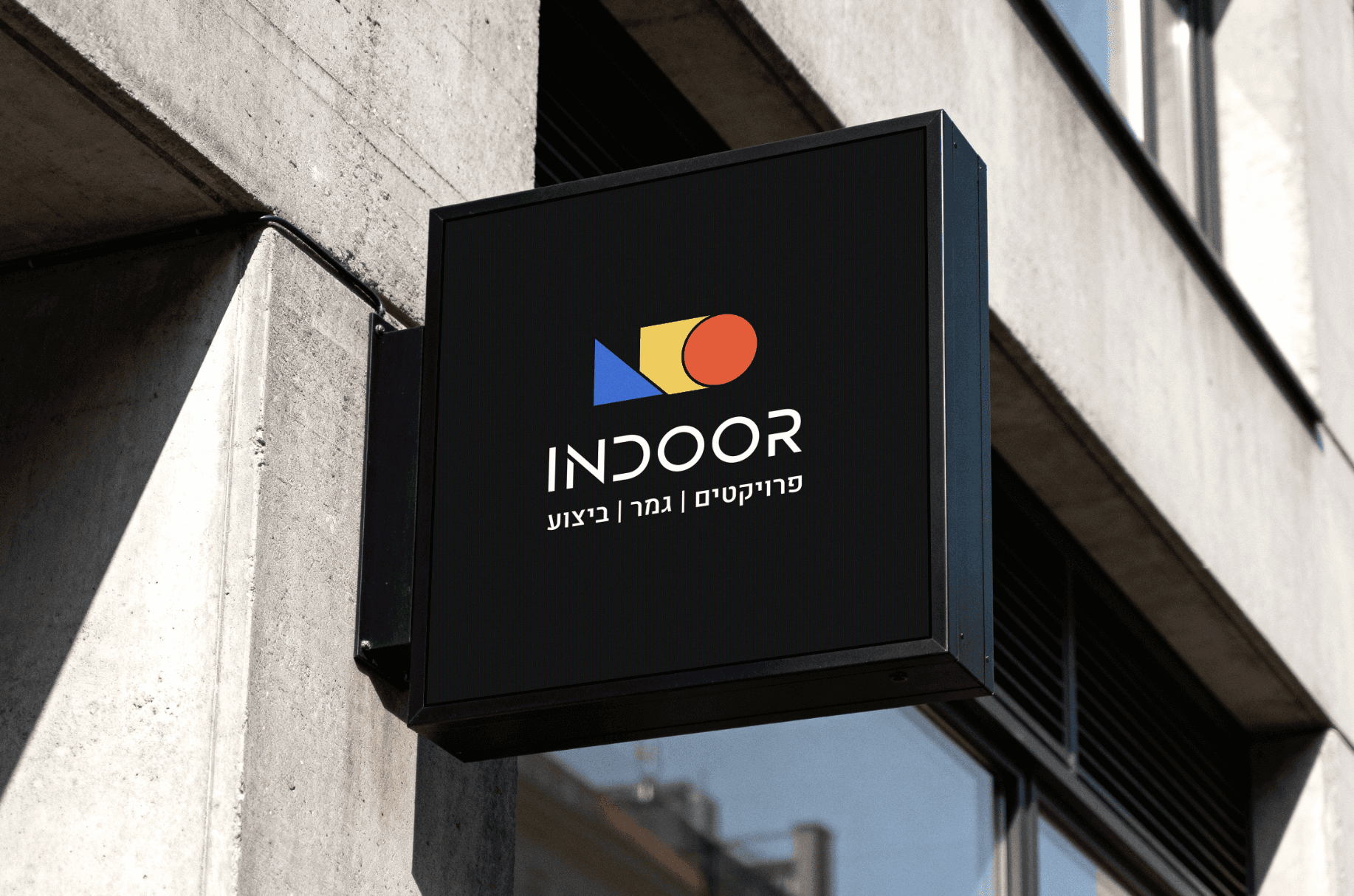
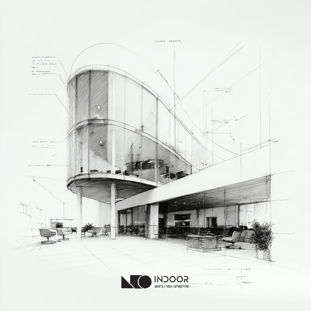
For Indoor, I created a bold and structured brand identity rooted in fundamental geometric forms. The logo is built from a circle, triangle, and square - abstract representations of foundation, direction, and stability, echoing the logic of construction itself. The result is a clean, confident mark that translates architectural thinking into a timeless visual language, balancing strength with clarity and modern simplicity.
Category
Branding
Year
2025


